Is the starting point clear?
Evaluate the first action a reader takes when looking for content, checking whether the interface makes the route into discovery understandable.
Designing a richer editorial platform, from discovery to delivery.
2024Editorial platformDesign & Delivery Lead

I led the full redesign of SoccerBible’s editorial platform, from shaping the requirements with stakeholders to designing the experience and working with engineering through delivery.
Beyond launch, I implemented the measurement foundations and continued iterating with the team, connecting design decisions to how the platform performed.
Explore the processI led the full 2024 redesign, working with SoccerBible stakeholders and engineering from inception through delivery and ongoing iteration.
Defined requirements with stakeholders, led UX and visual design, validated content-finding journeys and worked with engineering through implementation.
Responsive navigation, homepage and article layouts, reusable editorial blocks, competition sign-ups and a data layer feeding GTM, GA4 and team reporting.
Active users grew 137%, sessions grew 156% and bounce rate fell 17% in 2025 vs 2024.
01 / CONTEXT & CHALLENGE
SoccerBible is an editorial platform exploring football through culture, fashion, product design and the people shaping the game.
Its audience extended far beyond the website. The opportunity was to give that audience a richer destination, with clearer routes into the archive and more room for editorial storytelling.
Move beyond a chronological article grid. Make the most important stories easier to find, give editors flexible ways to curate content, and build the measurement needed to keep improving the experience.

02 / DISCOVERY & INSIGHTS
I reviewed the existing experience and the Umbraco publishing workflow with the SoccerBible team. Their editorial needs shaped the brief, while Lyssna testing helped validate how readers found content.
Four findings that shaped the experience. Select one to explore the design response.
01 / THE DESIGN RESPONSE

02 / THE DESIGN RESPONSE

03 / THE DESIGN RESPONSE

04 / THE DESIGN RESPONSE

03 / EXPLORATION & WIREFRAMES
I explored how different layouts could change the weight of a story, a topic or a collection.
Early concepts tested more expressive editorial grids, featured stories and filtering. Wireframes then established the responsive structure across the homepage, navigation and search, giving stakeholders and engineering a shared basis for discussion.


RESPONSIVE FOUNDATIONS
The homepage wireframes established a repeatable rhythm of lead stories, article grids, editorial features and themed sections across desktop and mobile.


04 / NAVIGATION & DISCOVERY
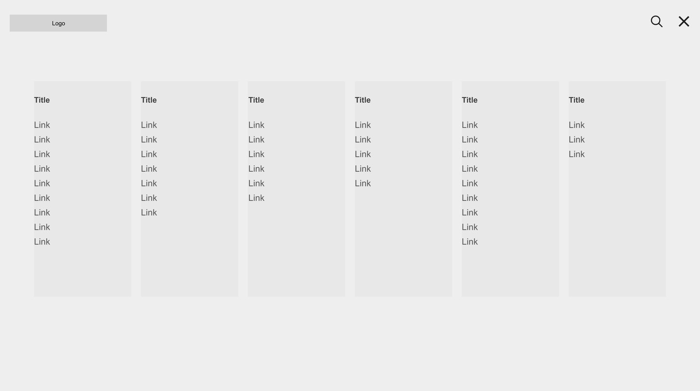
The navigation supports browsing by interest. Search provides a more direct route to a specific subject.
I organised disciplines, popular tags and series into a clearer hierarchy, and paired search with category shortcuts. Desktop and mobile retain the same content logic while adapting the layout to the screen.


05 / USER VALIDATION
I used Lyssna to test whether people could find content in the prototypes, alongside first-click testing of where they would begin.
The feedback was positive and supported the design direction. The testing formed part of the wider conversation with SoccerBible stakeholders throughout the project.
Evaluate the first action a reader takes when looking for content, checking whether the interface makes the route into discovery understandable.
Test content-finding tasks through the prototype, considering the journey beyond the initial click.
Use testing alongside editorial requirements and development discussions to guide the experience through to delivery.
06 / THE DELIVERED EXPERIENCE
I designed a set of reusable blocks and page layouts that let the team decide what deserved more attention.
A lead article, a group of stories around a World Cup, or a dedicated topic section could have a different presence on the homepage. Article layouts maintained consistency while allowing variation in imagery, content and storytelling.
Combine lead features, supporting articles and full-width editorial blocks to establish a clear hierarchy.
Give collections and editorial moments a dedicated presence instead of relying on their position in the latest feed.
Support different article layouts within a consistent system, including a block for competition sign-ups directly within an article.


Current website screenshots show the delivered system with later editorial content. The redesign was carried out in 2024.
07 / DELIVERY & MEASUREMENT
I stayed involved from inception through delivery and iteration, working with SoccerBible stakeholders and engineering throughout.
Alongside the full UX and visual design, I helped define what was needed, worked through implementation with development, and put the analytics in place so the team could understand the live experience.
Connect audience needs with editorial priorities, keeping stakeholders involved as the scope and designs took shape.
Work with engineering to carry the responsive designs, reusable blocks and content journeys through implementation.
Use reporting and ongoing collaboration with the team to support improvements beyond the initial release.
ANALYTICS IMPLEMENTATION
I implemented a data layer that passed information through Google Tag Manager into GA4, then created dashboards and reports the SoccerBible team could use to monitor clicks, views, traffic and acquisition channels.
08 / RESULTS
Year-on-year reporting showed growth in traffic, active users and engaged sessions, alongside a lower bounce rate.
The redesign established a more flexible editorial experience. The analytics implementation gave the team an ongoing view of how that experience was being used.
Year-on-year comparison: 2025 vs 2024.
09 / REFLECTION
Better discovery depends on editorial control, clear structure and a way to keep learning.