14 days / Define
Competitor analysis, customer needs and core journeys framed the opportunity.
Designing for loyalty, beyond the next purchase.
2022–2026Mobile appProduct Owner & Design Lead
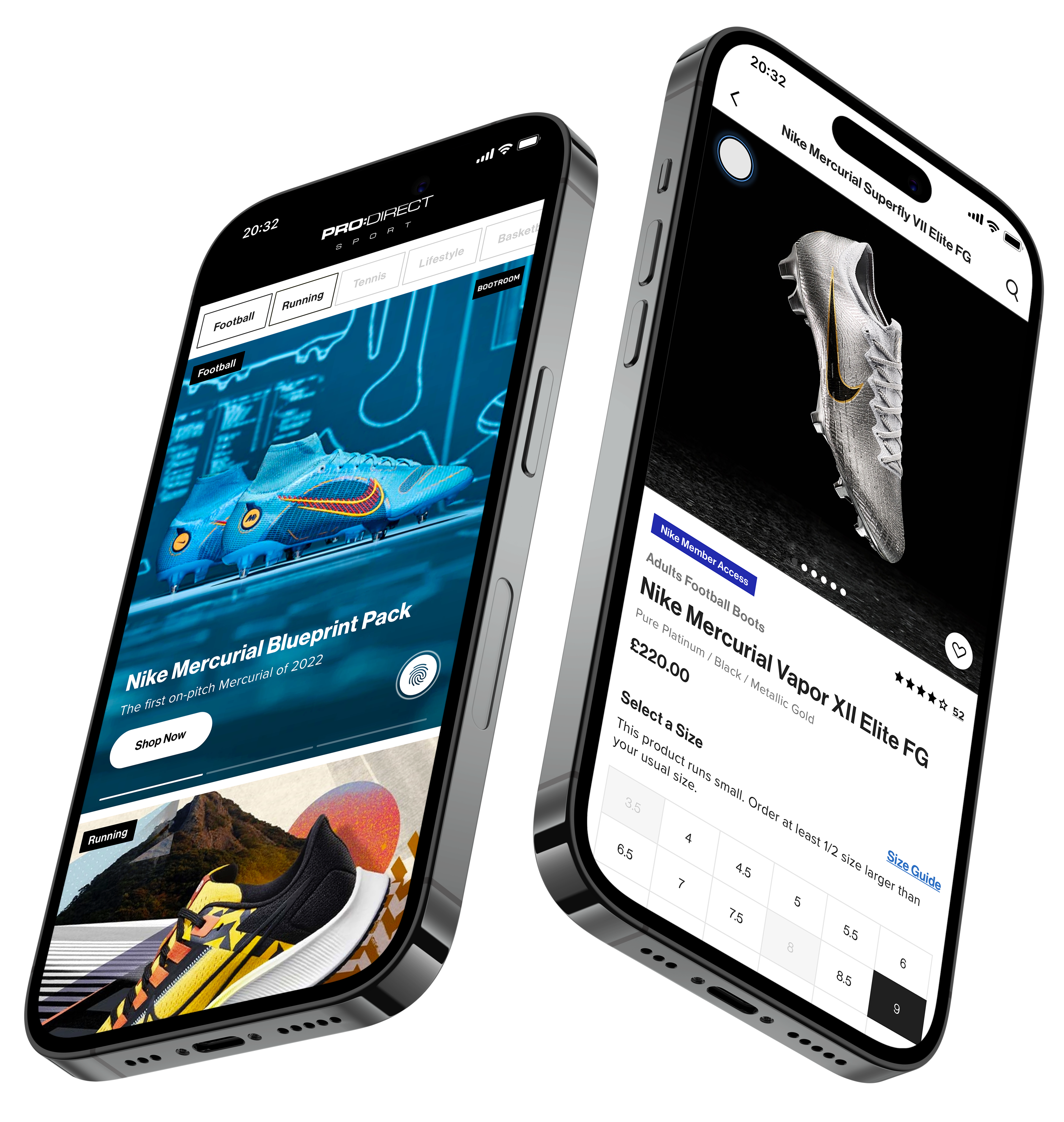
I delivered Pro:Direct’s retail app from start to finish, leading design and working with engineering throughout as product owner. Developed in partnership with Nike, the app needed to give customers a reason to return between purchases.
My work covered the app experience, a custom Google Analytics implementation, App Store creative and advertising rollout designs. I continued to own and grow the app after launch, taking it beyond one million UK downloads by 2026.
Explore the processI delivered Pro:Direct’s app from start to finish, leading design and working throughout with engineering as product owner. I continued to develop and grow the UK app after launch.
Owned the experience from discovery and design through engineering delivery, launch and ongoing improvement.
Translated customer and business needs into delivery priorities, complete app journeys and reusable UI, with custom analytics to measure performance and guide what came next.
£26m in app revenue during 2025, alongside over 10,000 five-star App Store reviews.
Football boots are an occasional purchase. The app needed to earn visits between transactions.
Personalised discovery, exclusive access and a clear shopping journey formed the proposition, delivered within a fixed Nike launch window.
Historical results from the original case study. Downloads combine iOS and Android.
As product owner and design lead, I worked with the Business Analyst, engineering and testing teams to deliver the app from discovery through launch.
Competitor analysis, customer needs and core journeys framed the opportunity.
Sketches, wireframes and prototypes supported reviews and 150+ final artboards.
A phased release, analytics and customer feedback shaped the next iteration.
RESEARCH / LOOK BEYOND THE TRANSACTION
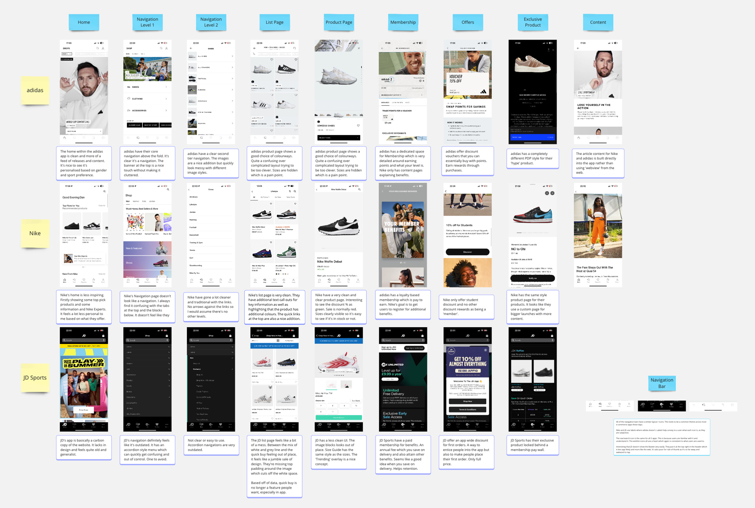
I compared Nike, adidas, JD Sports and Lovell Soccer across discovery, navigation, product detail and membership, looking for reasons to return as well as paths to purchase.
Personalised feeds offered more relevance than generic retail content. Onboarding preferences became an input to Pro:Direct’s Discover experience.
Navigation clarity and visible sizes stood out. Clear product information and a direct purchase path were priorities.
Membership, offers, exclusives and editorial content supported return visits. Pro:Direct combined these benefits with its Nike partnership.
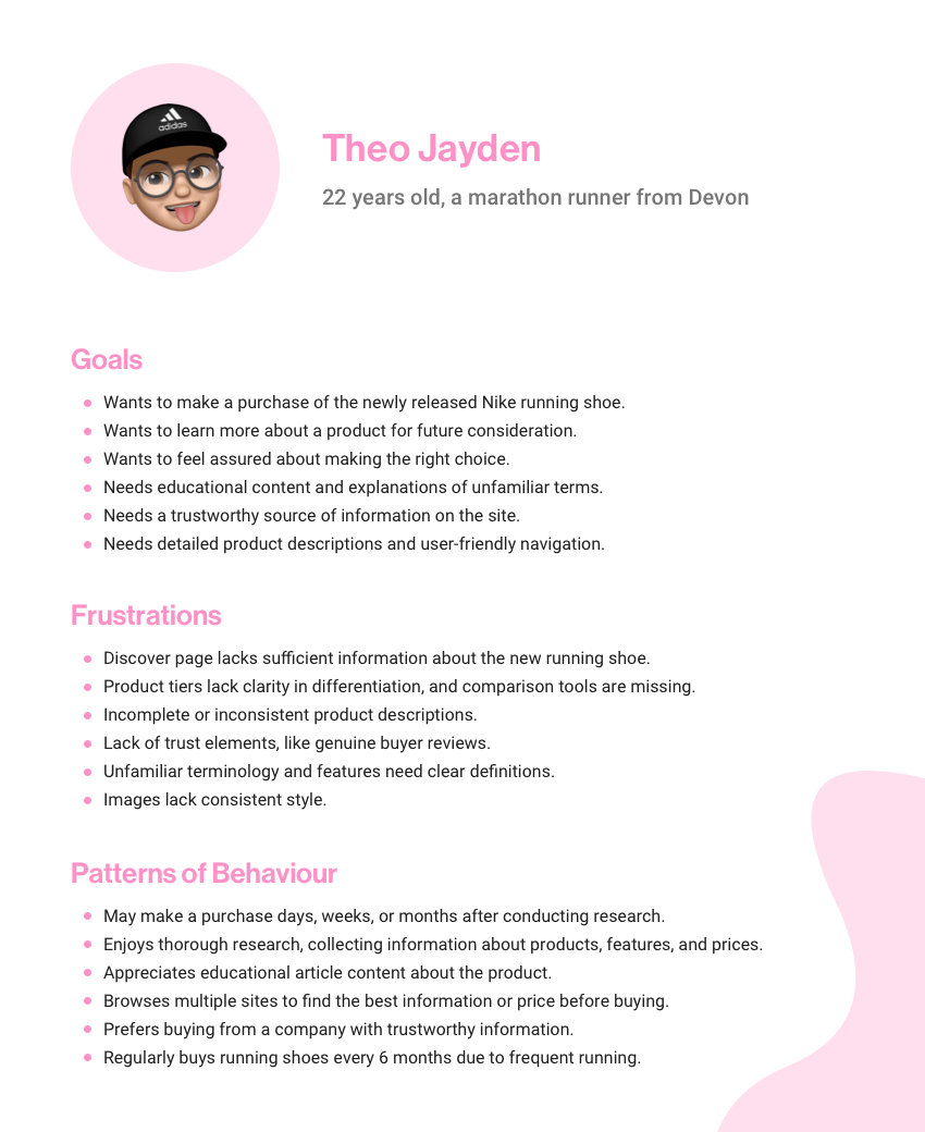
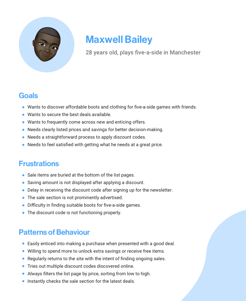
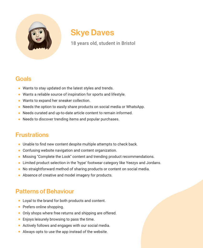
PERSONAS & JOBS TO BE DONE
I used jobs to be done alongside personas to connect context, motivation and outcome. Four needs shaped the experience: purchase confidence, informed choice, value and discovery.
When buying boots for my child, help me confirm the product and ground type so I can purchase confidently.
When researching running shoes, help me understand the differences so I can choose confidently.
When shopping for five-a-side, help me find suitable kit within my budget.
When browsing for inspiration, help me discover styles and content that match my interests.
EXPLORATION / FROM IDEAS TO CONNECTED SCREENS
Sketches made journeys tangible; wireframes helped the team review navigation and interactions. Prototypes and stakeholder reviews refined the direction within the 28-day design window.

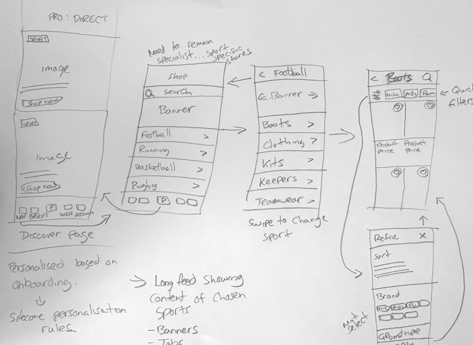
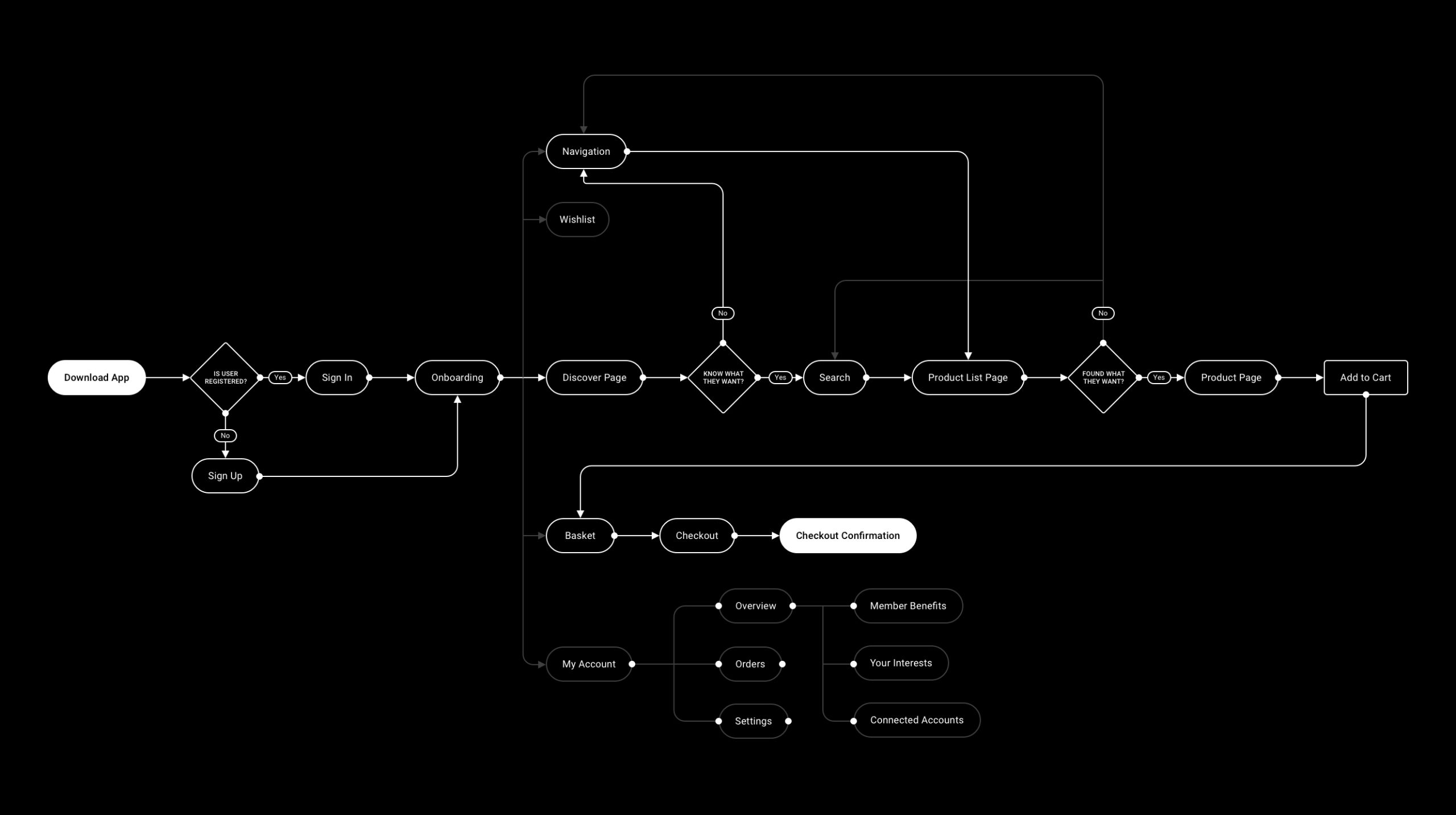
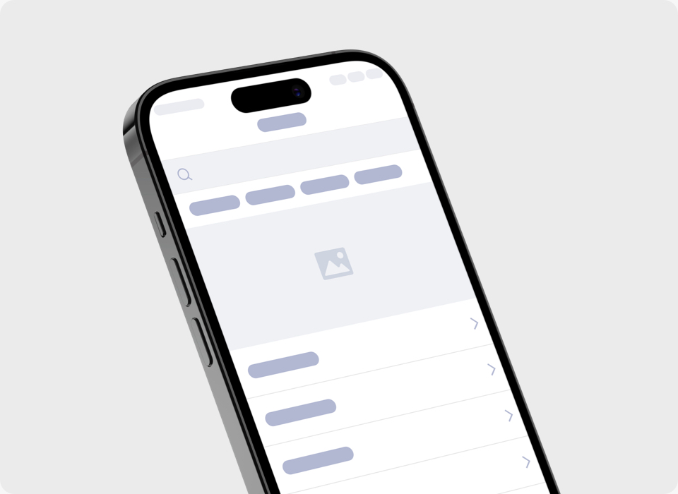
I reviewed hierarchy and functionality before refining the UI, keeping the discovery-to-purchase journey coherent.

Onboarding captured sport and product preferences. The homepage combined content from the customer’s selected sports.
My Interests refined brand and product preferences; Sitecore also used these for targeted notifications.
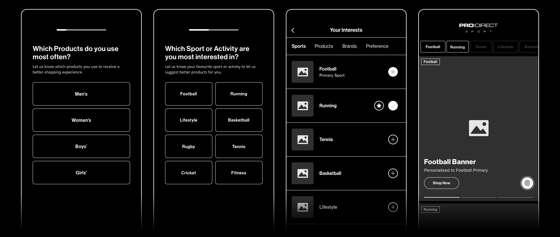
Choose one or more sports to see their content combined into a personalised homepage.
Content based on your selected sports.
Illustrative content showing how selected sports combine in the homepage feed.
Exclusive launches, early access, offers and editorial content gave customers reasons to return.
Clear navigation, product information and a direct route to the bag connected those visits to shopping.

Shared typography, colour, inputs and reusable components kept the app consistent.

Black-and-white UI let partner imagery lead. Semantic colours distinguished feedback and product states.
Three action sizes established hierarchy across shopping, journeys and editorial content.
THE DELIVERED EXPERIENCE
From onboarding and personal discovery to filtering, product detail, the bag and account preferences.
 Welcome
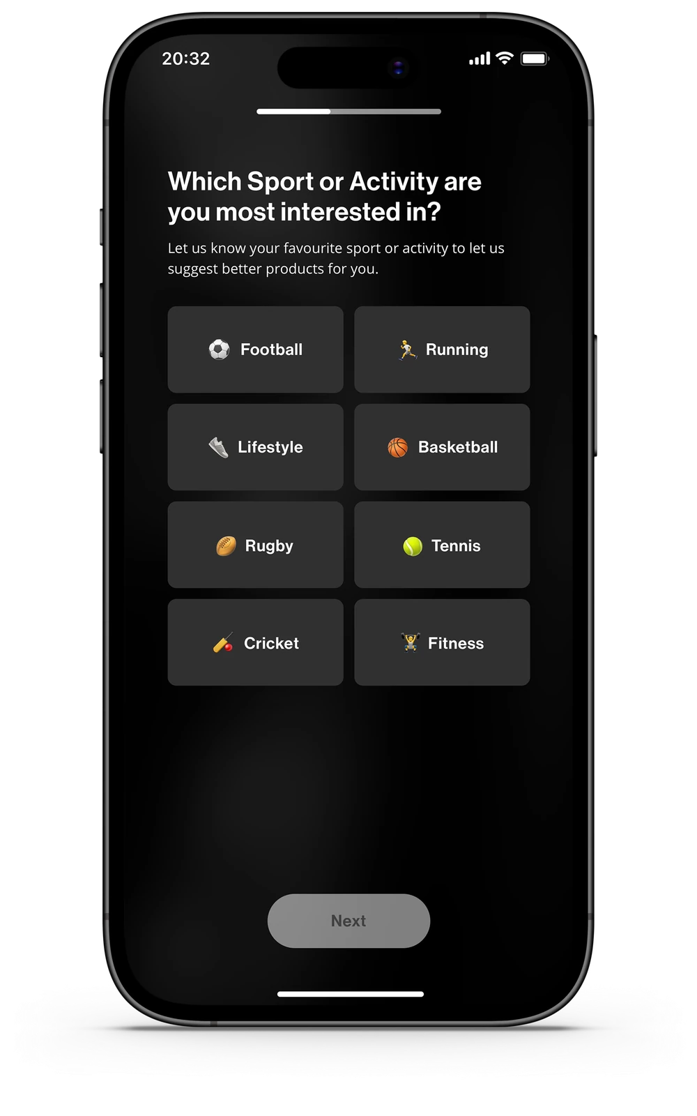 Choose your sports
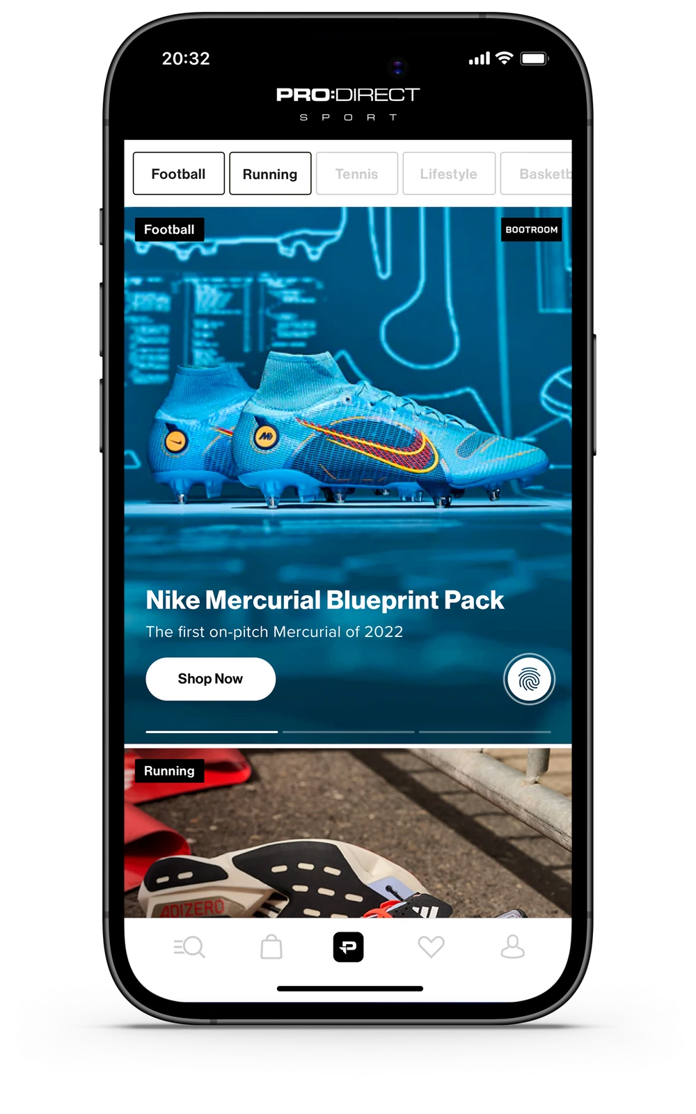 Personalised discovery
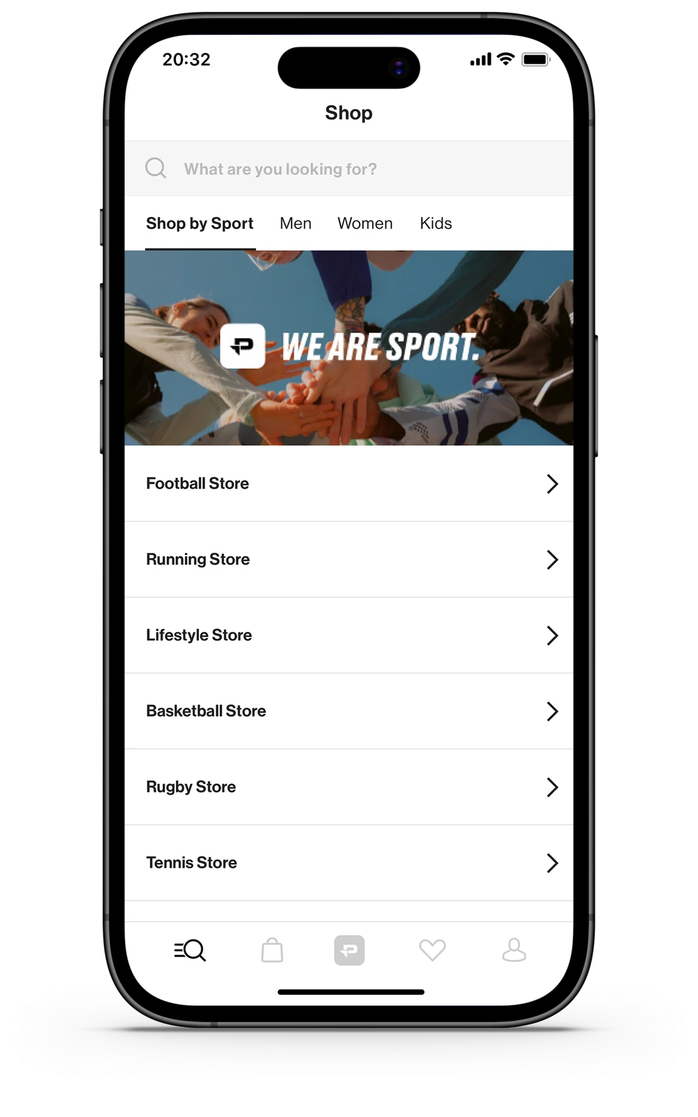 Shop by sport
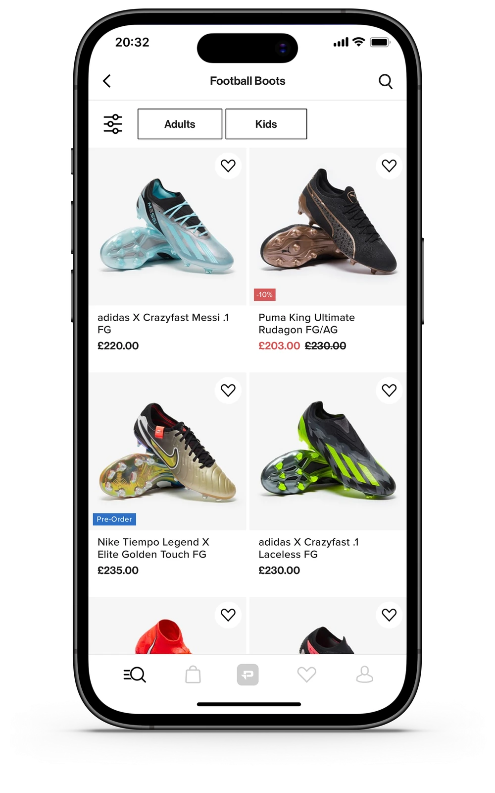 Product listing
 Refine results
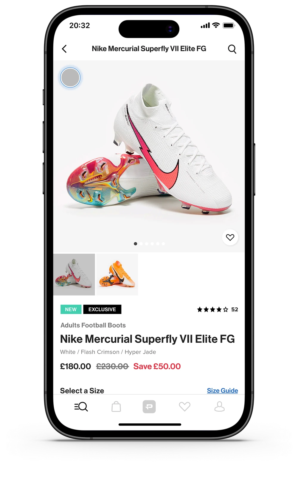 Product detail
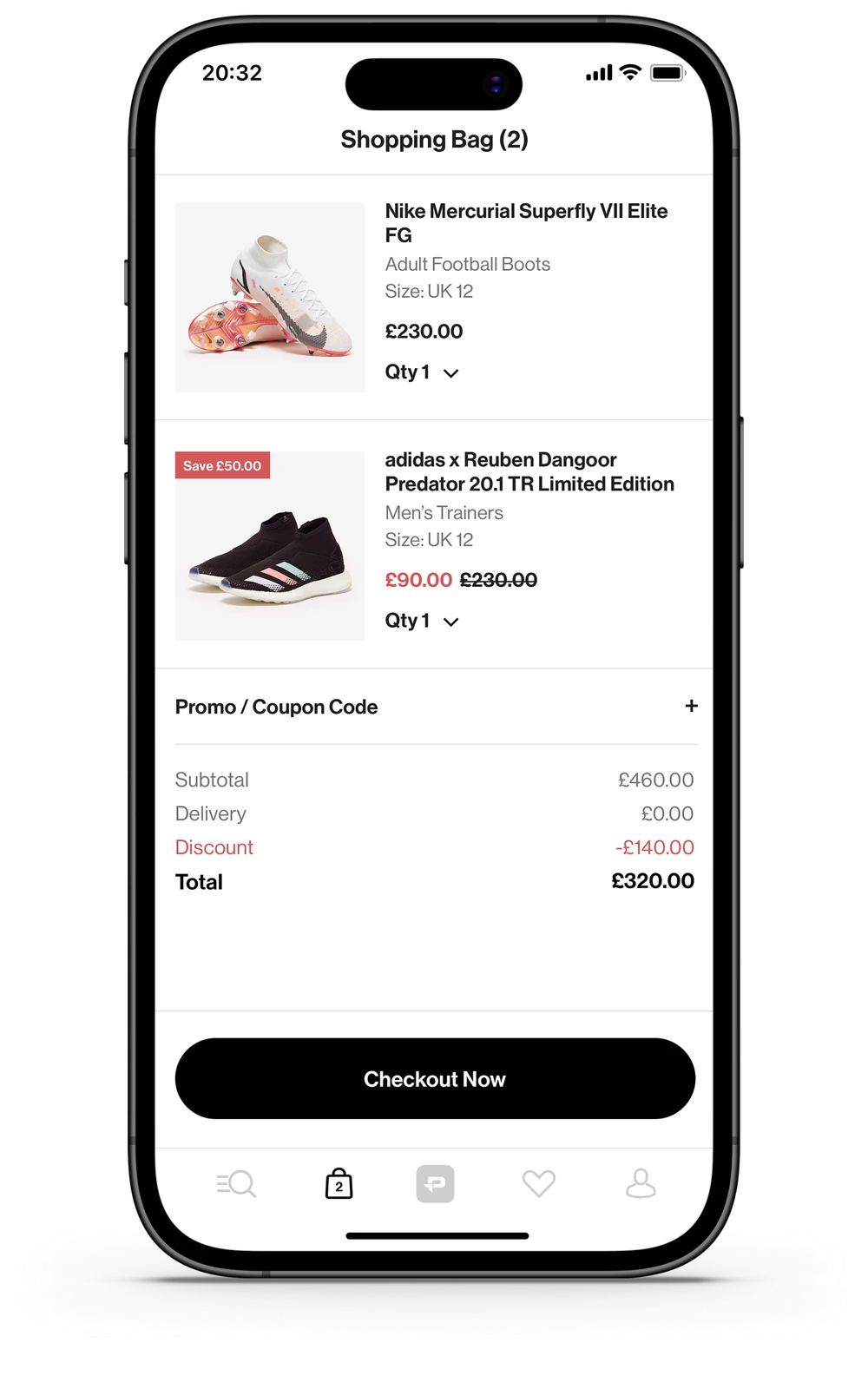 Shopping bag
 My account
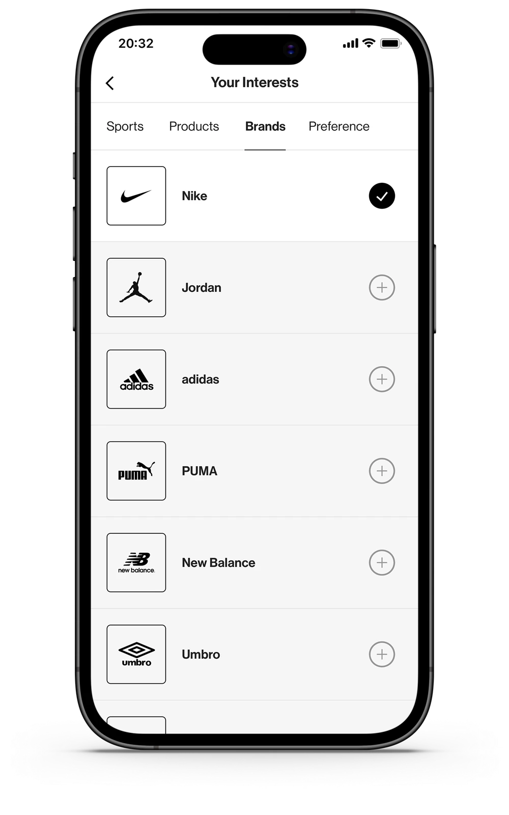 Your interests
We released in stages to identify issues before widening access.
Introduce the app to existing members and gather early feedback.
Widen access while continuing to observe usability and reliability.
Combine analytics and customer feedback to identify issues for the next phase.
We tracked acquisition, repeat visits, engagement and commercial value.
I delivered a custom Google Analytics implementation to understand app behaviour. GA4 funnels revealed drop-off; reviews, customer service and the survey helped explain it.
A positive commercial signal, with no matched cohort or measurement window documented.
The reported audience mix suggested repeat engagement; it is not a cohort retention rate.
Figures reflect the original post-launch reporting, not current performance. These are observational results; they do not isolate the effect of individual design changes.
POST-LAUNCH RESEARCH / LISTEN TO LIVE USE
Reviews, customer service and an incentivised My Account survey helped us separate reliability issues from new feature opportunities.


Sale lists, restock reminders and launch reminders led the requests.
Incentivised app-user survey. Preferences informed Phase 2 opportunities; they are not evidence of shipped features.
I worked with the team to reproduce issues, separate bugs from opportunities and shape Phase 2.
We prioritised speed, measured page responsiveness, explored code and API optimisation, and introduced loading skeletons.
We reproduced checkout and session issues, then investigated them with developers and testers.
A discontinued welcome code still appeared in App Store imagery, exposing a mismatch between the offer and the customer promise.
Feedback above is grouped by theme; the loading headline is a paraphrase, not a verbatim customer quote.
A loyalty product needs both a reason to return and an experience worth returning to.
05 / CONTINUED OWNERSHIP
My ownership continued beyond launch, growing the app into a significant UK revenue channel.
I stayed involved in its design and delivery through 2026, working with engineering to develop the experience as the app grew.